
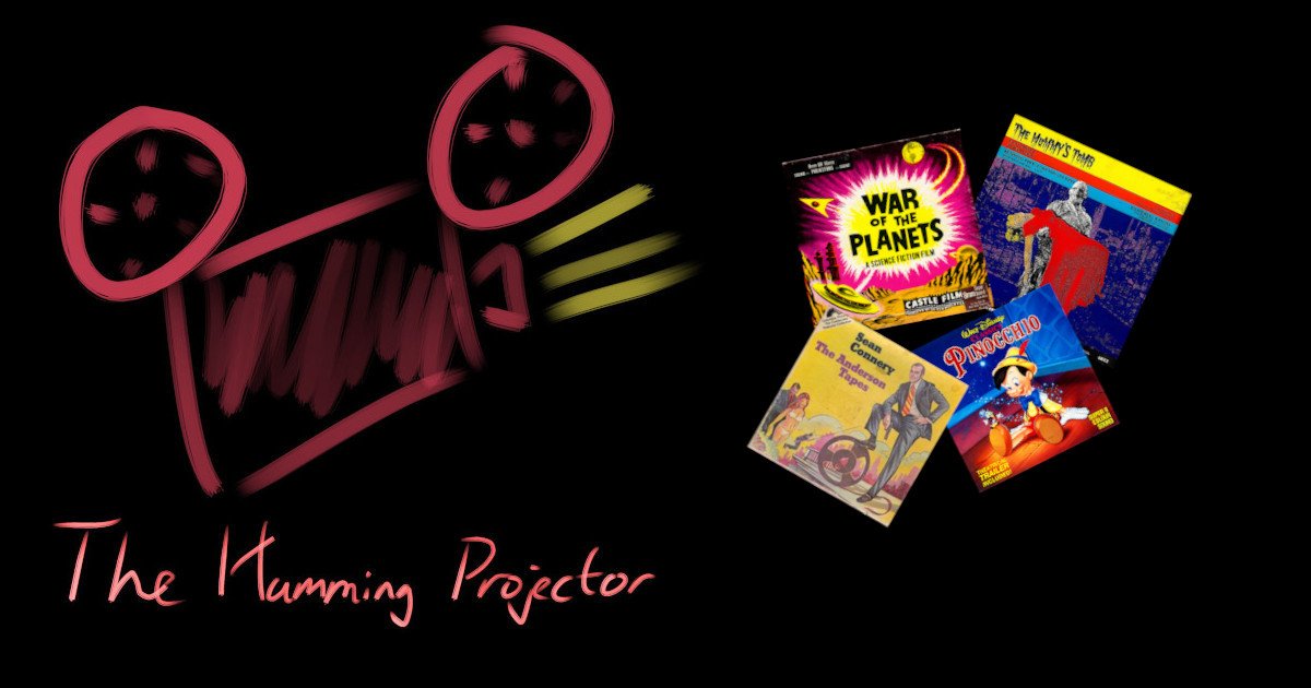
09 – Boxes and box art
Beautiful design, quick and dirty design or even no design at all? Cardboard, clamshell or hard plastic?
In this episode Eivind and Doug talk about boxes and box art.
Some of the topics we cover:
- The artistic side of boxes
- Why did some expensive prints have cheap design?
- Which distributors had the best designs?
- Fan art
- Different types of boxes
- Which box types had the best survival rate for Eivind’s collapsing shelf?
- What do we do with damaged boxes?
- Best and worst designs of boxes we have owned
- Why were the Disney designs from Derann so much better than the rest?
Links:
In this episode
-
 Eivind Mork
Host
-
 Douglas Warren
Host
Chapters
Transcript
*Music* Beautiful design, quick and dirty design or even no design at all? Cardboard, clamshell or hard plastic? Welcome to another episode of the Humming Projector Podcast where we will talk about boxes and box art. And with me today to talk about boxes and box art I have my good friend Douglas Warren. How are you doing today, Doug? Douglas Warren: Oh, doing just fine. How about yourself? I'm doing well, thank you. And very well now that we are going to talk about film. When I decide to watch a film I usually go to the shelf even before the projector is out. I look through the films with no special plan really and I tend to look at the good box art covers first. And I find it fascinating that those good covers Attracts me like that. And fascinating it is to such an extent that I think it deserves its own episode. It's fair to say that it's mostly a Super 8 and Standard 8 thing really. I know I have a couple of covers on 16 as well and so they do exist. But it's mainly a Super 8 and Standard 8 thing. Have you seen many covers on 16, Doug? No, when I was involved with the 16mm end of the hobby. Every time I got a 16mm film in it was usually in a can. I don't think I ever got one with an actual cover. I created my own covers for my 16mm prints for a little while. Then I decided, you know, I was going to leave that for the 8 and Super 8mm films. When it comes to the Super 8mm and Standard 8mm films, do you present the boxes nicely on the shelf? I guess my films tend to be organized and I have a cabinet that I actually keep them in. But the nice thing about the cabinet that I have, that I've got the majority of my films in, is the way the design. It's a metal cabinet, but it's got holes down the sides of the drawers that allow ventilation. But I have to say, like when I open up the drawers to pick a film, I do tend to rotate them, you know, and yes, the best looking box art tends to float to the top. You know, that's what I'm going to generally pull. Like Castle Films, which I know we're going to touch on our favorites, which those are my favorite box art covers, and those tend to be on the top. And more often than not, that's what I wind up grabbing. And that's how I tend to arrange mine. I like to see the side of my cover so I can spot them easily, but I'm not organizing them that well, really. I have seen pictures of shells with covers very neatly presented, and it really, really looks good. And I always think, "Oh, I want to do that one day." But for now, they are kind of mixed. 200 and 400 reels mixed up and not looking that good. But I like to see the sides so I can easily spot the right one. But one day, one day, I will get that neat shelf. Like the ones in the pictures on the internet. I fully understand. It's a thing of just how much space do you have. You know, another advantage of 8 and Super 8 films, you don't have the space issues. That was a big problem when I was into 16. And I love the fact that, you know, the smaller gauge, you can get a heck of a lot more on a shelf. You know? Yeah. And they look good. There is an artistic side of the box art. Some are really high artistic quality, I would say. And others, not so much. And I would say I'm also fascinated by the bad covers. I don't know how you feel about that. But I kind of like the bad covers also. Oh yeah. Oh yeah. I have a - Since I predominantly collect digest, you know, 200 and 400 foot, I've got my - I've got a wide variety of good and bad. And I agree the bad ones for me sometimes are more entertaining to look at than even the better ones. Just because you just - I have kind of a fascination with how that ever got past marketing to actually get put out. Yeah. And we also have drawn covers and also photos. And the styles of the vendors can also vary a lot. So there are kind of many different artistic expressions there. But one thing I really like when it comes to covers, I like to instantly see which distributor it is. And some are easy to spot. Like some of the newer universal ones, you can see it even before you can read the text, you know it's a universal cover. And the same goes for Walton and Ken Films. When you see that red square with Super 8 on the top of the cover, you know it's a Ken Films. Definitely. I really like that. So that's one thing I wish more distributors thought about. Maybe I'm damaged because I work with Super 8 database. So I'd really like to know which distributor it is. So maybe others don't really care, but I do. We have cheap cover art or even no art on expensive prints at all. And I really wondered, why not use some extra quitter box on a print when it really costs a lot of money and end up with a super cheap cover! Or even no cover at all. They could be glued paper on the front of the box or maybe just a stamped text of what the film is. I understand it was expensive with fancy covers, but something better than plain paper, like generic covers at least. I really am fascinated by that. How they could sell that expensive films with those bad covers. How do you feel about that? Yeah, I don't get that either from a marketing standpoint. You know, film's never been a cheap hobby, so it's like they were cutting corners on some of the packaging back in the day. And I have seen ones like you're describing that are nothing more than like a white cardboard box with a stamp of the title on it. Or with like Atlas Films did, they had a very generic cover which was very crudely drawn and they would, you would have the stamp of what was in it. You know, of course Atlas was a, you know anything about their history, they were a bit of a fly by night company anyhow, but I never, I don't get that myself. I mean, and it is one thing I've learned in my own research that bad, like bad box art, you know, it's not, you know, that's worldwide, you know, I've seen terrible box arts from Europe and I've seen more than my share here in the States. You know, um, I don't understand that really. No, I didn't either. So that's your, that's your selling point with a product. Why are you packaging it poorly? I don't get that. I asked Jed Jones about that and we will get back to that a little bit later because I really wondered about that Jed Jones from Duran. But before we go there, I want to continue talking about generic covers. But because a lot of the films sold were actually sold with generic covers. You had general boxes for series like Film Office for Tom and Jerry. You can, you can spot it, it's a Tom and Jerry, but the name was stamped on every time. And I must say that I prefer the unique but general over plain covers like the Tom and Jerry general covers for Film Office. They look okay. There's nothing wrong with it, but it's, you have many of those, many of the same. So you really, really need to look at the side to see what it is. But if I could choose between that and a plain cover, of course, I would choose the generic cover. But again, I wonder why they didn't do more with them. Yeah, Castle Films did that for at one point with their science fiction movies where they had a very generic cover. And they eventually moved on, I believe, and went with more traditional style artwork. But they went through that with some of their science fiction titles where it was just a general cover. I know it had like a, you know, flying saucer on it. And I mean, it wasn't the worst art. It was okay. But then the film would be stamped on the side. I've got a few of those that are like that. And some of those same films that were in that type of box art eventually moved on and got their own box art. But I guess it was a cost saving measure at the time. I don't know. But like you though, I would rather have that than just a plain white box that's got the film stamped on the side or the top or whatever. I noticed that some box arts could change over time. You can see on the Super 8 database that the same release would have different covers. And I asked Jed about that. And he said that early labels were somewhat lacking, almost pathetic. And as the labels turn into full color, it was decided to produce new ones for the better sellers. And that makes sense. When you see who did better, you perhaps chose to put a little bit more effort into those. And of course, I guess the printing technology made it a bit cheaper over the years, I would suppose. So in the early days, of course, it could be expensive to make a good print. That's a good point because you see the evolution. And I always go back to Castle because here in the US, of course, you know, Castle Films was like the golden standard for, you know, packaged movies for years. And Castle, especially during a particular period, like in the 60s, to me, they had some of the very best artwork. On their films. And then when they became Universal 8, it kind of took a major decline. If you know what I'm talking about. They went from original artwork to what I call their Andy Warhol period with some of their film boxes. And I think those were absolutely terrible. I've never talked to anybody that really likes those that much. And that's also when they went to the hard plastic cases, which in theory might have been a good idea, but long term it wasn't healthy for the films. I fully agree. Except for one thing I like is that I instantly see that those Andy Warhol kind of plastic covers were from Universal. I don't have to look it up even. That's true because they were the only one that were producing those types. Like I said initially, I think the concept was initially was like, okay, this isn't so bad. But as we all know now, long term, it was unhealthy for the films. But I'll tell you one thing though, I will take those over the clamshell cases because those have done more more damage over the years in my opinion. One little trick I learned with the Universal 8 cases is to make those viable is you drill holes in them and allow air flow. And I've done that on a few. And it'll, it works. And the clamshell, not a fan of those. I actually, I don't, anytime I've gotten a film in that's in a clamshell, even if the case is in good shape, I still remove it and put it into cardboard. Because I don't, those have done too much damage long-term to films. Yeah, and the clam shells also seem to be more brittle over the years, so. Oh, always. I don't think I've ever gotten a clam shell in that wasn't falling apart at some point. No. Or starting to crack. And even those that I had that were okay, I had a breakdown on one of my shelves this summer, where it actually fell off the wall. It was my mistake, of course, but that was terrible. I remember that. Wow. I came to the cabin and I found a big pile of films. Oh no. And what I was going to say is that it became pretty evident which boxes survived that better. If you take like 100 films and see which ones survived them. The clam shells, of course, were damaged in the corners pretty quickly. I think the defects looks even worse than the defects on the cardboard boxes. Defects on the clam shells once looks terrible, start away. And the hard plastic covers they either survive or absolutely disintegrate. Yeah, that's true. That's true. I have, for example, I have World in Flames, the series in hard plastic covers. And I think at least one third of those have broken when mailed to me. Even though they are, it's up and down how well they have been packed. But even though the ones packed quite okay tend to not survive shipping. So I'm not not a fan of the hard plastic covers. Yeah. I think at least one third is broken. Yeah, I just kind of developed a policy years ago with my collection that, you know, more often than not, if it comes in, if the artwork is good and the box is in really nice shape, well that's a keeper as far as the box is concerned. But if it's clamshell, as I said, it immediately goes into a cardboard box. And I'll adapt - I'll adapt my own thing for the artwork on it, which I've done for years anyhow, when even original cardboard boxes come in in bad shape. Which is not uncommon, as you know. I know I must sound like I'm a real hater on the clamshell, but the only Super 8 films I've ever gotten in that suffered from - and yes they do - Vinegar Syndrome have been films that have arrived in clamshell cases. I've had to throw out a couple of prints because of that. Yeah, and one other thing with the clamshells, they often tend to be bumpy over the years. The front can become uneven at the surface. And when that happens, not much you can do. Yeah, they don't take temperature change very well and you start to get the wavy texture on it. And more often than not, the only thing that I wind up salvaging from those is I'll cut them open if they're already in bad shape and I'll pull the artwork out. But those that have been taken care of and been stored well, they look good on the shelf. I must admit that. I've seen pictures from German collectors with a lot of clamshells and they look beautiful when they are okay and stacked up on a shelf. I won't disagree with that, but I guess in my experience, like I said, I've just I haven't had much luck with the ones that I've received. And I'm pretty certain, thinking about it now. I don't have a single clamshell on the shelf. Like I said, they usually go into cardboard boxes that I buy and do my own artwork on them. And talking about German clamshells, one thing I've seen from some of the German releases is that they sometimes have bigger covers for smaller reels. When you see the cover, you think it's a 400 and you open it and it's a 200 and sometimes even a 300. Yes, I've noticed that. That's a strange one. I see the point, because on the shelf they will all look the same when they are at a big size, but I sometimes get a little bit disappointed when I open it and think, of course, it was a 200. Yeah, of course, Ken Films was notorious for doing that with their 50-foot rolls because the cartons they put those 50-footers in basically were the size that would fit a 100-foot reel. And from what I understand, that was just an old marketing ploy. You know, "Oh yeah, I'm going to get a bigger reel," but you were just getting a 50-footer. And like I said, it would have fit a 100-footer easy. Which is not a common size for Super 8 or 8mm reels. Anyhow, I actually have one or two, believe it or not. And to be fair, the cover says how much film is inside. Like Piccolo Films from Germany always states that, how many meters it is. So they don't cheat you, but you know, it looks better with the big box. Still, you know, so what do you do when the boxes are not perfect? Have you ever bought a second copy of to get a better box? Oh, yeah, I've done that a few times. Not real often, but I have done it some, especially if it's a title that I'm really, really a fan of. I have done that before. Heck, I've even bought some three times to finally get a better quality box. And let's be honest, with collectors nowadays, the boxes I think are as important as the film that's inside. That's pretty evident if you frequent the forums and the groups. That's a big part of the collecting now. You know, that's a big part of it. So, if you have old tiny boxes, to be fair, some releases, unless you want to pay through the nose, you will end up with some tiny boxes. Do you replace them with black ones or with blank ones, or perhaps with a printed front? What do you do with those that don't look good? What I easily tend to do is just get plain white boxes and I create my own artwork and paste onto the boxes. It looks better than having a box sitting on the shelf that's falling apart. I know a lot of people do that and it makes sense. But I feel really, really bad inside if I throw away a box because I feel I throw a bit of history away. So I tend to keep more than I probably should of the boxes. I used to save a lot of boxes but then again I also have sold a number of box collections because people wanted the original boxes. I've sold off probably three lots of original boxes because what I tend to do... I have a friend in the adjoining state that does the same. He will make compilations especially when you're dealing with the old black and white like Silent Digest and he'll get like a 400 foot reel and he'll fill it up full of little 50 footers all spliced together or a couple of 200 footers and I do a bit of the same and so sometimes I'll have the original boxes left and and those will get sold to other collectors. Right. I choose to always keep mine in the original length. Again for me it's like keeping the original history but I of course for 50 feet you have to change a lot so I see the point. I want to do one plug though for Super 8 database as you might know. Absolutely. As the listener might know I also run the Super 8 database and on the Super 8 database you can download the cover so if you have missing a cover or if you have a very very bad box and can replace it with a blank white one. You can go to Super 8 database for many of the covers and download the PDF with the correct size to that cover and print that out and that might be better than the ones you already have. So that's a tip for today. Another cool project when it comes to Walton boxes is the site super8filmboxes.wordpress.com I will link to that in the show notes. That's a project that John Armour from the UK had where he with the permission from the descendants of those that run the Walton company. He printed Walton boxes, generic boxes but with the Walton design that you could use for those tiny boxes you had from Walton. They look really, really gorgeous. He has not many left but some are left and you can head over to that link that I will link to in the show notes. And I must say I really love that project and I hope that others will do the same with other distributors as well. To be fair, a lot of boxes not look that good anymore. I would love to see somebody do that. Like here in the States, I'd love to see somebody, you know, reproduce like Castle Film boxes and heck even some of the Kinfilm boxes. It would be nice to see them replicated. And I hope that's kind of a trend for the hobby. I think it's great what John's doing for Walton. It really is. Let's head back a little bit to the covers again. Because we talk a lot about the box art. But who really were the designers? And I tried to figure that out and we don't know much. I can't find a lot of information about the designers. There's actually just one single name that I've seen from doing the design of the box releases. And that was Marianne Frost that did some of the designs for Duran. And the only reason I know that is because Jed at his Duran Vault Facebook group. I've linked to that also in the show notes. If you are not a member of that group I highly recommend that you join it. But in his group he sometimes mentions some of his releases and some of the designs were made from Marianne Frost. And that's the only name I know of any of the designers. And her designs were I think it did really well. And she was married to one of the customers and they had regular meetings to discuss the labels at breadth length sometimes. But it wasn't very often they rejected a label design. I thought it was cool that actually there were one name that we can actually know something about. Yeah, because I figure with a lot of these companies it was probably either a freelancer that was hired or maybe like in the case of Universal probably somebody in-house in their art department. But like you said these were generally nameless people. There was usually no signatures on the boxes so you had no clue who did the artwork. I had one theory and that was that covers were more important back in the day when the films were presented in shops. But more generic covers were probably used in later years. That was my theory. I suppose maybe Ken films and perhaps Walt Disney films were sold in shops. I know. But in later years we know that many of the films were shopped of mail order and things like that. And I asked Jed how important he thought it was with the cover designs. How well it was presented. How much important that had. And he said that I personally don't think that the labels were a significant part of the customer making a purchase. The 8mm community were pretty knowledgeable about the films available and knew what they wanted before they came into the shop. They did look good at conventions and it's just possible that we did pack up the odd impulse sale. But still why didn't I do it a little bit better and Jed basically said it's a matter of cost and labels were a waste really. So even though we could wish now as collectors in the 2000s that they spent more time in it. I guess it's business-wise we're not worth the money to spend more on the covers. But a little bit sad though when you think about how much were spent on the films I would say. Well, I think here in the States back when 8mm Super 8 were more of a consumer product like in the 50s, 60s and 70s. The packaging was more I guess more important, more prominent. Because I mean the first time I ever remember seeing packaged movies when I was a little boy. This is the 60s, 1960s. And we had a camera shop in the town in Texas I grew up. And I remember going in there with my dad because my dad shot a standard 8 film when we were kids. And I remember being fascinated by this rack of kin films, castle films, and seeing all the horror titles which is a little boy, you know, I was fascinated with. And that's, you know, there you go again. It was the box art that attracted me. And I was like, oh my gosh, you know, there's Frankenstein, a Dracula film. There's Rodin, you know. And I was just totally taken. I think that's what, even at that young age, what just drew my interest in, was seeing those box arts. And department stores in the U.S. also generally had film departments, camera departments that also had easily a couple of racks of movies like that. I remember many a time just sitting there and I'd stand there looking at those things sometimes until they ran me off because I guess I thought as a little boy I was going to try to, you know, grab something and run. You know, try to steal. But I was just absolutely fascinated by all the titles. And there you go again, that box art is what drew me in. Yeah. And that makes sense when you present it like that. But as Jed said, for Duran, people didn't tend to like accidentally bump into the shop for Duran, I guess. So it made sense for them to not put that much effort into the covers. But there's one exception for the Duran covers, if you have noticed. Some of the covers were quite good, I would say, but some are standing out like exceptionally well. And that is the Disney releases they made. I would say that one of the best covers produced really for the Super 8 world. And do you have any idea of why those were so much better than the others? Uh, I guess again, it depends upon what films you're talking about. I would think, um, I don't know. I know the answer really, because I asked that. Because I was curious. I'll let you spell then, so I don't make too big a fool of myself here, but you go ahead. I would be interested to hear your theory, because I was way off. I had no idea. The answer was really, Disney demanded it. That's a plain answer. Having dealt with Disney on a different plane, on a business sense, like I did at one time in a former job of mine, I absolutely am not surprised by that. That's sort of the way they operate. It was strange for me when I started thinking about it, because you can see one of the latest covers from Duran for other titles were okay, but not much. And then the Disney covers are beautiful. Yeah. Well, that would make sense. That would make sense. That's Disney, you know, pushing and protecting their brand. That's just the way they tend to be as a company, you know, and they have, that's their intellectual property. It makes sense. They're, I mean, they're an iconic brand. And Disney is another company when it came to package films. Always liked the way they did the box art in their films. Yeah. I personally, now we're treading off into something. I'm getting a little off track here, but one thing Disney used to do, and I know some collectors have bashed them for this, but they would tend to do more excerpts than they would digest. And I always personally liked the excerpts because they did such a great job with them. I mean, the excerpt they did from 20,000 Leagues Under the Sea, which also has box art I really like, is one of my favorites. And I have, why have a copy of that? And that's one, speaking of that, that I did several searches until I got a really good box with. I got lucky, not only did I get a good box, I got a beautiful print with it too. And that's one of my favorites. It's in probably my top five films in my collection that I enjoy watching. It's such an exciting sequence with the squid, you know? Yeah. And sometimes I would even say that the box could be more interesting than the digest inside, depending on the digest. There's a lot of truth to that too. I have some especially old sci-fi movies where I absolutely love the covers. It could be cool to watch the sci-fi digest as well, but the covers are really, really cool. For example, War of the Planets and Earth vs. the Flying Sorcerers and Radar Men on the Moon, three examples of covers I really love. And even though the digest can be cool as well, I really love those covers. So I must admit that sometimes I buy just as much for the cover as the film inside. Oh, absolutely. Matter of fact, of the three films you mentioned, I would say the Earth vs. the Flying Sorcerers is probably the best edited of the three. The other two are a little, they're okay, but they're not the best in my opinion. And I have all three, so I think I can speak on that. And maybe there's a difference between collectors vs. film lovers, perhaps, where the collectors focus more on the items. So the boxes means more than the film lovers that perhaps cares more just about the film. I don't know, but... I absolutely agree with that. Yeah, I've even had a couple of collectors tell me that, that the box art is generally, for this point in time in the hobby is, you know, the collectability of the box art is more important than the contents of the film. So we have touched this topic, but which distributor do you think had the best covers? Well, again, I have to speak, I have to say this up from, I have to speak more from a viewpoint of somebody in the in the US and the States, because I've had, I know I have films from like Duran, Walton, others, Film Office in my collection. I have to speak more with what I have the most experience with, and that's US distributors. And I think I've kind of dropped that earlier, but my favorite was in their heyday was Castle. Yeah, they were good. Castle Films. I mean, I just love their box art back in the day. Their horror, not just their horror science fiction titles, but other ones as well. That is until the Universal 8 Andy Warhol period came around, and then... Because in my notes I wrote exactly that. Not Andy Warhol, because that was an exceptionally well-expression, but I don't like the two color pictures with green and white or pink and white or blue or white. It didn't work for me. Yeah, it lacks imagination for one thing. And I'm a former art student, so I look at that and go, that's just lazy, in my opinion, when I see that. And now one thing I do want to touch on, I don't know how some collectors feel about it. I don't have a problem with it. But I know here in the US, as the height of the super right phenomena was started to die off in the early 80s. I know it kept going strong in Europe with Duran leading the charge, thankfully. But when it started to die off here in the US, honestly, the last probably glory year for that here was probably 79-80 is what I'm going to say. It was limping along and maybe 81, but by 82, it was dying on the vine. But when companies, you know, the Ken releases of MGM films, ABC movies did this as well. They moved away from original box art and they started using the film posters on the boxes. Now, I didn't have a problem with that because, I mean, let's be real, that's that was original promotional materials for the original films themselves when they are in the theater. And I don't have a problem with that at all. Actually, to be truthful, I preferred that, you know, compared to some of the, let's just be honest, like Ken films, some of their original artwork, which tended to be sometimes interpretations of the movie posters done very poorly at times. Yeah. But I don't mind actually a bit lower quality art as long as it is something special that stands out, you know, of course, it's to a certain extent, if it's really bad, it's bad. But I like that you can get an impression of the film straight away, get into the story straight away, in a sense. So at least if they try, I prefer that way over any generic cover. Because some of the generic covers are boring. I mean, for example, the Columbia generic cover from Columbia that you have the Oh, yes, yes. The red and yellow one with that. There's a lady with a torch there. Maybe that's Libertas, the Roman goddess of liberty. Or perhaps, I don't know who she is, that one with the torch there. But there's just too much going on. And the title of the film is just some tiny, tiny text. It's stamped on. Yeah, it's stamped on, yeah. If they even try a little bit on the artwork, I would prefer that way over the generic ones. Yeah, Columbia did try to start, they did produce some original artwork. I know I've, you know, some of their science fiction titles. And which, one of the four hilarious ones in my opinion, even though it was, I felt that it was one of Columbia's best digest because it had zero narration guys, just letting you know was the movie Felsafe. Which is, you know, a nuclear thriller, but a very good film if you're into that genre. But the box art was absolutely hilarious because the fun part was trying to pick out, because they didn't do a very good job of, you know, trying to, I guess you could say, draw the actors. You're trying to figure out which one is Henry Fonda, which one is Walter Matthau. I mean, it was so poorly done. It was truly hilarious. Now, that's funny, though, because they did actual box art on the 400-foot release. On the 200-foot, they actually had a couple of photos from the original film, which was interesting because I used to own the 200-foot print, which I'm, I no longer have these films and I'm trying to eventually hunt them back down if I can get good copies. But, um, Columbia and also Columbia did a little bit of the Andy Warhol stuff like Universal 8 did, like 20 Million Miles to Earth. They had that kind of, kind of really sloppy, bad artwork on it, which was pretty funny. But, um, I don't know. I mean, like, getting the bad artwork, which is, again, a fun topic to me. The worst of Ken films wasn't as bad as some I've seen out there, which, I don't know. I just have a fascination with that, again, from an art student standpoint. You know, it's like, how did they ever get this? Well, whoever agreed to let this go out, you know? But, again, like I said, it was probably some relative of the guy that ran the company, you know? It reminds me a little bit of the African movie posters. I don't know if you have seen that on the internet, but there have been a few around where some cinemas out there in Africa, they had just a local guy probably working at the cinema trying to make a movie poster and that was what was hanging on the wall there. I get a little bit the same impression as they say, it's probably a relative of some of the ones working there. Yeah, the gentleman that ran Ken Films, Bob Lane, which I really wish that... I'm assuming Mr. Lane is probably past now because you're going back quite a few years when Ken Films was around, but I wish people like him, I wish, you know, because we have a name associated with the head of the company, I wish eventually somebody could find more information out and put out more of a biography on this guy because I would love to read that. I love the history of film companies and again, that kind of rolls back into the whole box art thing again because there was an article about Ken Films and Bob Lane was mentioned and the person who wrote the article, he also had said that it looked like all their artwork was done by his 10 year old nephew because they were taking a bit of a poke at it. I, you know, I have, I personally with Ken Films, again because that was a very popular consumer brand of home movies here in the US along with they, they and Castle were the two biggest. I, I think there's a certain charm about their artwork. It may not be the best. Some were really, really bad, but I do find it, I do find it, like I said, it's kind of charming in a way, you know? I think so too. I like the Ken Films boxes. Yeah, I mean like, um, uh, I love the, I don't know why it's simple, but like the artwork on Flight of the Phoenix or something about it, I just really like. And you're perhaps, I'm not an art person And, and perhaps you're right with, with it being more charming than, than really good, but I would go with charming.
Yeah, that's a good point. Talking about lower quality covers. Um, some people make different covers, try to, to make their own covers. Um, perhaps to, uh, brush up some of the lower quality ones. Um, what do you think about non-original art or fan art? Um, do you like that or is that not for you? I don't have a problem with that at all. I guess because I've had to, I haven't done it from scratch, but the fact that I've had to recreate, uh, you know, from whatever my tastes were at the given time, you know, when I've taken films out of, you know, battered boxes, put them into white boxes, plain film boxes and have decided to do new artwork on them. I don't really have a problem with that. I tend to generally look for, um, movie posters that I print and, you know, put on the boxes. But if somebody wanted to create something original from the ground up, I don't have a problem with that. If it's done decently, why not? You know? Yeah, if they like it, of course I have no problem with it. But for me, it's about the history again. So I'm not into fan art. And again, for Super 8 Database, I have got the suggestions many times to add fan art because they are better than the ones that were originally there. And, but I have decided to not include them because for Super 8 Database, at least it's more about preserving the history. And for in my own collection, I could have done differently. But again, I would stick with the original one, even though there are bad ones. Totally understand and respect that. Yeah. But I, but I see that many of the fan art made out there is really, really good. So hats off for them too, for making something nice. Well, I understand. And I totally respect that as well. I understand that, you know. And for me, restoration is something else than new design. So printing a cover from Super 8 Database, when it's so bad that you can't see what it is, I don't have a big problem with that. Because for me, that's restoration. But new design is something different. Well, I wanted to mention something, if I may. The fact that you have that option on Super 8 Database, where people can print that out, you know, so they can, you know, get fresh art, you know, the fresh covers that they can put on their boxes, I think that is incredibly great. Because it does allow people to do their own form of restoration for their films. And I just want to say, I think that's a wonderful option you have on there. I mean, it's just, I look at it as another way to keep this hobby preserved. And I guess I'm getting on a little bit of soapbox there, but anything that'll keep it alive and keep it viable is fine with me. There's just two more points on my list of topics here. And the first one of those are, have the headings, frustrations. There are two types of frustrations I have when it comes to boxes. The number one is the wrong film in the box. Yes, I know about that. I've been there. You see that nice box and you really look forward to see that film and then, ah. Yes, I've had that happen. But the second one, yeah, the second frustration I have with boxes, which is actually more about the boxes, are stickers from sellers where the box have a sticker on saying the number of the film or the price of the film or the quality like B+ or something. If the seller has chosen nice stickers, they come off well, but quite often they rip off parts of the cover which really frustrates me. So I wish they didn't do that. If they have to do that, at least do it on the back side and not on the front. So that was a little No, I completely agree with you on that topic 100% because I have dealt with that before where I've gotten films that I've had little stickers on and they didn't pick the best spot to put them on and And you're like "I want to remove it, but how much of the box art is it going to tear?" And more often than not, because you're already dealing with like if it's a cardboard box, you're already dealing with old paper anyhow, it takes it off and I really don't like that. But then we are getting towards the end of this topic here and I have just one more question for you. What is the best and worst cover of all the films you have owned? Do you have any experience that you want to share with your covers? I think as far as best and again you know I think that's a matter of taste because it's going to also boil down to you know a favorite film in your collection. For me it was the war title "Too Late the Hero" from ABC Films. They did an adaption of the movie poster but it was so well done. I mean just looking at the picture was action-packed and it gives you an ideal what you're dealing with with the movie. I think for my personal taste that was one of my favorites. One thing I do want to touch on for a second if I may. I know we could probably sit here for another hour talking about this so much so much to talk about with it but I mentioned how Castle you know when Universal Films became Universal Light Films or some of their films you know they went through doing the Andy Warhol thing with some of their titles but they also started if you remember they went the movie poster route with most of their 400 foot and up editions. They did that uh something most people don't generally mention but you know you think of movies like The Sting you think of okay like Battlestar Galactica they all went those later releases for a couple of years before their demise they went the movie poster route with their packaging which I was fine with that again because I don't have a problem with that. Again I'd rather see that than some really poorly done artwork. uh worst? Um okay I'll probably get pinged by some of the listeners about this because I can't remember the title right off the top of my head but it's a film that I mentioned to you earlier it was a Dracula title that had absolutely the worst artwork I'd ever seen. I remember drawing like that when I was about six years old and the amazing thing about the title was that they actually repackaged it two or three times with the same box art but with slightly different colors until finally they improved it. I'm thinking that was one of the films that was released by Allied Artists before they were acquired by before their titles were acquired you know like Allied Artists Republic before Ken acquired them but it was really horrible and now I'm gonna probably wind up looking this up when we uh get done with this because I just I'm old I'm forgetting the title okay over to you what's your best and worst for me again when we talk about best it's more like getting the right feeling on the field more than the top top art for me so um the best cover I have is probably War of the Planets it's a coastal film release it's a pink and yellow colors in an explosion of flying saucers flying around uh it's a lot of action going on an old fight looking like an old-fashioned sci-fi look um so I like that because I instantly get that 50s sci-fi feeling when I see the cover uh with a lot of action going on uh and I can imagine if I was a kid in the 50s or 60s I would have love that cover when it comes to verse cover it's it's a little bit strange because it's a film that uh digest I really love but uh it's the Anderson tapes uh a film with Sean Connery and it's one of the most weird covers I guess it's a bad Sean Connery stepping on a Super 8 reel with one foot it's uh related to the movie poster where he had his uh where his right leg was uh resting on something and for the Super 8 release it was resting on a Super 8 reel it it's um I remember that it's a shame really because because the the the digest is really cool I got it from a friend a long time ago and and and the digest is actually one of my favorite digests in my collection it's about a robbery and you can you can follow the um it's a story that really suits the digest format but the cover is it's not up there yeah I remember that one I remember that one that well that was an odd odd choice I thought on Columbia's part because like I said again Columbia had some unique ones like the failsafe one I mentioned with the really terrible box art on it yeah you can look it up on the Super 8 database if you want to see how that was and and the picture on the Super 8 database is actually my cover and with that I think we have actually covered most of the good points of this topic I guess
I just wanted to mention a project here on the on the podcast that deserves more attention and that is the Off2 project. You can find that at the off2.d. I'll make a link in the show note. And that is a project by Joachim Schmidt from Germany. He makes a lot of good videos. Some interviews and some of the videos have presentations of releases and where he talks about the releases and shows them cuts from the releases. It's really well made. It's mostly in German but all his newer videos have subtitles in English. So I really recommend that you go over there and take a look. And he's interested in many of the same things. That's me in the way of preserving history and then the research of the small gauge film just like me. And we were both approached from researchers in German actually. Me for the Super 8 database and him from the OF2 project where they were interested in what we had done and I would love to see more from Joakim and perhaps you will see him here later on this podcast. Another thing that we want to mention here is event called Film is Fabulous where members of the British Film Collectors Convention and the Blackpool Film Collectors Conventions are working closely with the de Montfort University's Cinema and Television History Institute to preserve valuable film collections held privately in the United Kingdom. It will be held this Sunday the 29th of October at the Phoenix Cinema and Art Centre in Leicester and there will be screenings on 35mm and Super 8. There will be special guests with expert knowledge of film collections and preservation and discussions on archiving of film and missing television episodes and there will also be film dealers there and preservation of history is close to my heart and I was really excited to see this going on in the UK. Whereas the German researchers that I have mentioned before and there is an article on the Super 8 database have been focused more on the impact of the Super 8 releases and their place in history. The British Initiative are looking more into preserving the copies in private collections and especially finding copies of TV episodes and films that might be missing in other archives. And any research looking at the small gauge formats is something I love to see and I wish I had been living in the UK because if I had I would surely be going there. And I will put a link in the show note to this event in case you live in the UK and have a chance to go there. And finally I want to mention the Blackpool Convention that will be held the 24th to the 26th of November 2023 at the Grand Hotel in Blackpool. As usual there will be the Friday film show with a feature and the Saturday film show where they show all sorts of digest and documentaries and everything. And the Saturday dinner and the dinner is the only thing you need to actually book for in advance. All of the things you can just show up. And on Sunday there's the film fair where many dealers including Classic Hope Cinema usually are there. And one thing I look forward to more than anything else at the Blackpool convention is meeting all the great collectors out there. And Joakim Schmidt that I just mentioned from the Off2 project actually plans to go there this year. So if you want to meet Joakim you can go there. Jed Jones usually is there. I'm not sure if I asked him if he'll go this year but he is usually there. And I always love to talk to Jed. He is such a nice person. And Shory that you listened to in the previous episode about Senesi. He will be there. And from my part of the world at least 5 from Norway and 1 from Sweden will be there. I don't know if that is a plus. I mean we come in peace. It's not like 1000 years ago in the Viking Age where we plunder your monasteries. I promise. And I'll link to the Blackpool convention. They have a brand new web page that have been around for a couple of months. I'll link to that in the show notes.
And I'll link to that in the show notes. If you enjoyed this episode and want to follow us, you can listen to us and subscribe to our podcast using players like Pocket Casts, Apple Podcasts, Spotify, Google Podcasts, Amazon Music, and YouTube. You can also use any podcast player supporting our SS. Go to our website hammingprojector.com to learn how to subscribe. You can also listen to any current and previous episodes on our website without any additional software. If you have any feedback for this episode or a suggestion for a future episode, please send an email to feedback@hummingprojector.com.
Finally, I want to mention a feedback that we got on YouTube from Silvo. He says: "Absolutely love these podcasts. Wonderfully entertaining and evocative of the great memories of years ago. I started collecting in 1973. Great job. How about doing an episode on all those wonderful film catalogues and adverts we used to drool over. Often not being able to afford them, but just reading the catalogues were pure magic." Silvo. And Silvo, that was a great idea and I have added that topic on my list of future topics and I'm sure we'll visit that one day. And if you have a suggestion for another topic or another type of feedback, we would love to get feedback from you. And with that, we have reached the end of this podcast. And thanks to Douglas Warren again for being here chatting with me about covers. Great to talking to you again, Douglas. Oh, it was a pleasure. I'm always happy to be here. Yeah, and I'm sure you will see Doug here soon again discussing a different topic with me. And my name is Eivind Mork and thanks for listening.
The End of the Weekend.